Models of the process of design are relatively common. (I have found about 150 such models, many of which are presented in How Do You Design?) Each describes a sequence of steps required to design something—or at least the steps that designers report or recommend taking. Models of the process of design are common because designers often need to explain what they do (or want to do) so that clients, colleagues, and students can understand.
Less common are models of the domain of design—models describing the scope or nature of practice, research, or teaching. (I have found only about a dozen such models.) Such models may be useful for locating individual processes, projects, or approaches and comparing them to others. Such models also help clients, colleagues, and students understand alternatives and agree on where they are (or want to be) within a space of possibilities.
Typically models of a domain are of three types:
1. Timelines
+ Lists of events from the domain’s history
+ Links between events suggesting influences
2. Taxonomies
+ Lists of sub-domains
+ Trees branching into categories and sub-categories and so on
3. Spaces
+ Venn diagrams indicating overlapping categories
+ Matrices defining the dimensions of a space of possibilities or area of potential
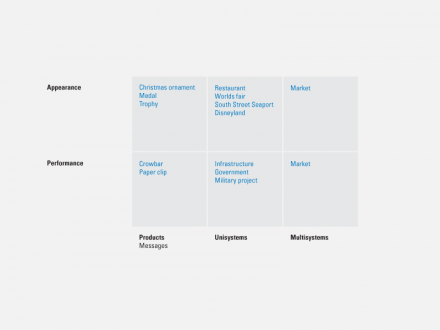
Among the very few spatial models of the domain of design is Jay Doblin’s 2 x 3 “Matrix of Design.” The rows are performance and appearance; the columns are products, unisystems, and multisystems.
Doblin wrote, “A continuum exists between pure performance and pure appearance. Some products, such as crowbars or paper clips, are clearly performance products. Others, such as Christmas ornaments, medals, and trophies…are purely appearance products. Still others, like automobiles, cups, and chairs, are combinations of both. The essential point is most products (and messages) can be conceived as primarily performance or appearance oriented.”
“Products, the simplest kind of design, are tangible objects, which can be touched, photographed, and comprehended. Objects such as cars, chairs and spoons and messages such as brochures, signs, or ads are all included.
Unisystems are comprised of sets of coordinated products and the people who operate them. They are more complex in design, perform more complex operations, and are not as readily discernible as products alone. A kitchen, an airline, a factory, and a corporation are all types of unisystems…the important concept in unisystems design is…the relationships and interactions between the items involved.”
“Multisystems are comprised of sets of competing unisytems. The retailing field or the office equipment
market are types of multisystems…Sears goes against JCPenny, K-Mart, department stores, and hardware stores…IBM, Xerox, Digital, Wang, Apple, and Canon are all pitted against each other” [1].
Multiplying columns and rows yields “six types of design problems that are fundamentally different.”
1. Performance Product Design—The realm of product engineering, where “performance is quantitative.”
2. Appearance Product Design—The realm of product “styling” and style, “not easily quantified.”
3. Performance Unisystems Design—The realm of technical planning and methods, often associated with infrastructure, government, or military projects. (The Design Methods Movement grew out of this type of project.)
4. Appearance Unisystems Design—“Environments
that…deliver a satisfying experience…usually designed by impresarios with an holistic approach. Projects begin with an overall vision of what the consumer’s experience should be, then the details of the experience are painstakingly worked out.” He cites as examples restaurants, worlds fairs, South Street Seaport, and Disneyland. (Doblin’s emphasis on experience prefigures discussions of experience design and service design by several years.)
5. Performance Multisystems Design—Groups of competing unisystems. Doblin gives no examples of performance multisystems.
6. Appearance Multisystems Design—Also groups of competing unisystems. And again Doblin gives no examples, nor does he distinguish performance multisystems from appearance multisystems. In fact he says, “design approaches for these two types of multisystems are similar.”
This comment is odd given that one of Doblin’s goals for the model is to “discusses how design methods and design specialists can be matched to the problems.” He notes, “Just as there are six distinguishable types of design, there are six different kinds of designers. It is a rare designer who is competent in more than one design type. The capability and experience required in one arena may actually obstruct a designer’s competence in another.”
Yet, Doblin himself questions the distinction between performance and appearance, “Unfortunately, the threshold separating performance products from appearance products can be fugitive, and is sometimes confused when the designer has one goal, the user another.” Of course, no product or system is all about form or all about function; all products and all systems have formal and functional aspects—and other aspects, too.
Perhaps we need to reconsider Doblin’s y-axis.
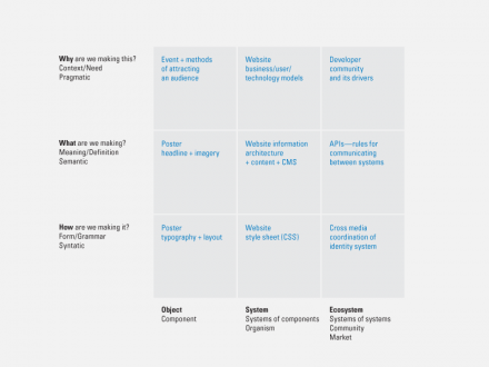
I propose substituting Charles Morris’s model of “sign function,” which he describes as having three levels: syntactic, semantic, and pragmatic [2].
Thomas Ockerse has argued that the result of any design process is a sign (in the semiotic sense). That is, anything that has been designed acts as a sign—loosely, it stands for something [3]. (Rhetoricians might say anything that has been designed makes an argument or arguments, including arguments for itself.)
If the result of the design process is a sign, then we may apply Morris’s model of sign function to things that have been designed—or more broadly to the space of things that can be designed.
1. Syntactic—The form or grammar of the artifact. How will this be? How are we making it? In Morris’s terms, “the formal relation of signs to one another.”
2. Semantic—The meaning or definition of the artifact. What is this? What are we making? What does it do? In Morris’s terms, “the relation of signs to the objects to which the signs are applicable.”
3. Pragmatic—The context (from which an artifact emerges and in which it will be used) or need (which it will meet). Why does this matter? Why are we making it? Who will use it and for what purpose? In Morris’s terms, “the relation of signs to interpreters.”
Matrix of Design + Examples – After Jay Doblin
In a rational design process, we might begin by understanding why something is needed—who will use it, where, and to what end; that understanding might help define what is designed—the structure and features that make it meaningful; and definition of what’s needed might help drive how the artifact looks and even how it’s made.
Of course, the process is rarely so neat or linear. Discussion about what may also change the way we understand why, and prototypes of how very often affect the way we understand what and even why. Still, we seek not just coherence within each level but also between levels. The structure of form must map to the structure of meaning, and the structure of meaning must map to the structure of the context. These mappings do not flow in just one direction; they are reciprocal. The design process involves iteration, adjusting structures at each level to achieve coherence throughout.
In the late 1970s, Ockerse explicitly organized RISD’s graphic design curriculum around Morris’s model:
the first year introduced students to form-giving exercises; the second year added greater attention to meaning; and the third year added practical considerations.
Meredith Davis has criticized this approach to design education, arguing that the distinctions are artificial. She has proposed a curriculum that engages students in issues of form-giving, meaning-making, and context-negotiating simultaneously.
In practice, however, the distinctions often correspond to commonly found responsibilities or “degrees of freedom” of operation.
Young designers typically find themselves working within a team structure where senior designers, managers, and clients have already negotiated many of the practical business issues. The problem at hand is “simple” in Horst Rittel’s terms, well understood—and already agreed—by the constituents. What remains is the working out of the solution within the established framework.
Space of Design + Examples
Also likely is that the message or feature set—the content, the information architecture, or the interaction sequences—have already been decided by others. Our young designer’s role is to “make it look good” or “professional” or “appealing” or even “sexy”. Doing so requires skill and benefits from training.
And this is where most design schools start (and quite a few stop). A typical problem in a graphic design class asks students to design a poster. The teacher provides the context—perhaps a poster promoting a concert for the Boston Pops. The teacher also provides much of the message—the copy to be included. The teacher may even specify the size, particular colors, and typeface. All that’s left is for the student to arrange the elements. Each student should produce half a dozen or more variations.
A class of 25 students produces 150 variations, which provide the basis for a critique—a discussion about the student’s proposed form and perhaps its relation to the given message. Through prototyping and discussing, students come to understand the space of possible solutions—the degrees of freedom open to them—and the tradeoffs between various factors.
Projects like designing the form of a concert poster remain the reality of most graphic design classes at the undergraduate level today—and quite a few at the graduate level. Such formal projects are also the reality of much of practice. Not just for graphic design, but also product design, interaction design, and architecture.
As young designers gain experience, they may get opportunities to affect the way projects are defined. At first, that may mean simply having visibility into new projects and being able to express interest. Later, they may sit in on planning meetings and then client meetings. Eventually, they may take on responsibility for “running” a client engagement. In function, if not name, they become managers. Here they can affect at least how a design team organizes a project.
However, clients still constrain the level of engagement. Figuring out what product to build or which markets to serve are pragmatic business issues—the third level of the matrix—issues typically decided by the CEO or other “C-level” officers. Such issues are almost always outside the hands of even the product manager—and the designer.
It’s always good to remember at the beginning of each project to explicitly confirm the level of engagement:
+ Is the focus here making icons and skinning this interface?
+ Or do you want us to look at the interaction as well?
+ Who’s writing the copy? Or developing the content?
+ Is the product positioning “locked and loaded”?
+ Do you have user research to share?
+ Or would you like us to talk to users?
+ How will the product be distributed?
+ Where is value added?
+ How does the product pay for itself?
Mimicking this growth path with design class exercises is difficult. Critiquing formal issues is easier—simply less time consuming—than critiquing semantic issues. Asking design students to create content means asking them to write. That means the teacher needs to read and review what the students write. It’s difficult to imagine teachers like Armin Hoffman or Wolfgang Weingart commenting on student writing. Even Paul Rand, who seems to have written rather well, never gave assignments that required students to write.
But why not extend our Boston Pops poster assignment? Shouldn’t students discuss the copy as well as the typography? Shouldn’t students discuss what makes an effective poster? Or whether a poster is the best way to attract people to a concert? Or perhaps even what the role of the Pops might be in Boston, in New England, in the US, or the broader music community—today and 10 years from now?
Rather than ask students to redesign (reskin or even reorganize) the Pops website, wouldn’t it make more sense to ask how the internet will affect the Pops’ long-term future?
That’s some of what moving from the bottom row up to the top row might mean.
Let’s come back to Doblin’s x-axis: product, unisystem, multisystem.
I propose replacing product with object, because product may suggest a thing to be sold, while the result of a design process need not be sold. Object also seems to be in the same family as system.
Unisystem and multisystem are terms of Doblin’s devising. While diligent readers may be able to decipher them, they are not immediately accessible. System seems clearer than unisystem. Likewise ecology (or Meredith Davis’s term, community of systems) seems clearer than multisystem. Ecology also suggests the dynamic, even living quality of a system of systems. In sum: Ecologies are composed of systems, and systems are composed of objects. The examples Doblin gives of multisystems are all competitive spaces or markets, but as Pytor Kropotkin noted, cooperation may be as important as competition in evolution [4]. Multisystems or ecologies need not be seen only as markets. Many large organizations (e.g, conglomerates, universities, and governments) are themselves multisystems or ecologies. And even some product offerings are multisystems or ecologies, (e.g, the Univers family of typefaces is a system of systems; so are integrated systems of hardware, software, networked applications, and human services, such as Apple’s iTunes and iPhone environments).
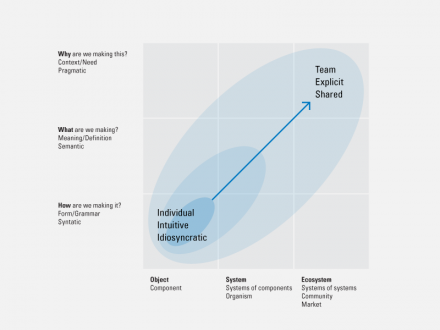
Traditionally, designers have focused on the lower left corner—crafting the form of objects. Such work can be direct and largely unmediated. Individuals work material in highly intuitive even idiosyncratic ways.
In the past 20 or 30 years, practice and theory have evolved. Ethnography and research about users and use are regularly incorporated in design processes. We might represent this change as expanding focus from the lower right and moving up the y-axis. At the same time, many designers have become involved in the design of systems and ecologies (or designing conditions in which ecologies may arise and thrive). We might represent this change as expanding focus from the lower right and moving across the x-axis. Such work is often indirect and mediated by models or maps. Teams collaborate, often by sharing explicitly defined processes.
Doblin noted, “For years, most design problems could be solved by using a combination of design training, experience, and applied intuition. But as the world and its design problems have become more complex, traditional approaches have become less effective.”
Differentiation and value may be created more easily by expanding beyond form to meaning and context and by expanding beyond objects to systems and ecologies—moving up and to the right. This shift reflects interest in design thinking and emergence of cross- or trans-disciplinary practices and educational initiatives.
Still, none of this diminishes the value of good form. Designers who love to make things look good should feel no compunction to expand their practice. We still need beauty.
Direction of Change in Design Practice
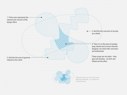
Areas of interest and concern of the design office, the client, and society. – Charles Eames
Among the models of the domain of design, perhaps most well known is Charles Eames’s diagram of the overlap between the areas of “interest and concern” of the design office, the client, and society. Eames’s model is sometimes erroneously described as “a diagram of the design process.” While Eames notes that the “areas are not static—they grow and develop as each one influences the others,” his model does not describe how design is (or should be) practiced; it describes where “designers can work with conviction and enthusiasm” [5].
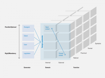
Space of Design Constraints – Brian Lawson
Brian Lawson has proposed a model of the space of design constraints, defined by three dimensions:
1. The generators of constraints: designers themselves, clients, users, and legislators. On this continuum, designer-generated constraints are the most flexible; client- and user-generated constraints less so; and legislator-generated constraints are the least flexible.
2. The domain of constraints, which may be internal to the thing being designed or imposed from outside.
3. The type of constraint, which he bases on function:
+ Symbolic: related to meaning
+ Formal: color, texture, shape, etc.
+ Practical: related to production
+ Radical: fundamental, related to the main purpose
Lawson reminds us that many constraints are self-imposed and that their flexibility varies considerably. His matrix provides a framework for cataloging a project’s constraints, a useful starting point [6].
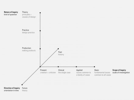
The Matrix of Inquiry – Richard Buchanan
Richard Buchanan has proposed a model of the space of design research, “The Matrix of Inquiry” [7]. Rick Robinson summarizes it nicely.
The vertical axis . . . is asking what drives a particular inquiry—from the immediate needs of production, through questions of (design) practice out to questions generated by theory. [Most research skews toward
the bottom.]
The horizontal or ‘scope of inquiry’ dimension presses a slightly different question upon us. By ‘clinical’ Buchanan refers to work primarily based on case studies. Again, were we to plot relevant work in the field, ‘skew’ would be a barely adequate description of the result. A single case study is often a powerful thing. But theory cannot be built on cases alone, especially when one case is rarely connected to the next. It is, as Buchanan’s diagram implies, a limited ‘scope of inquiry.’ If case studies are the only fodder for the conversation, there is no extension, little reach beyond the immediate, and no larger patterns or emergent issues for theory to make sense of. . .
But I think the single most important thing to draw from this model is found on his z-axis: past, present, and future as the ‘direction’ of inquiry. Future has this little paren after it: “(theory)”. What does that mean? Obviously, it could be prediction, in the sense of extending our understanding of the current situation into likely sequelae in the future. But there is also a much more potent way to understand it: that in this space—the ‘here’ . . . —theory of the future also develops the future, conditions the future.
In the gap between what is (now) and what might be, theory is action. This is especially true of the representations of theory we develop and deploy. Because we are in this conversation with the people and organizations who will populate the future with artifacts, affordances, tools, and ways of thinking, we are actively engaged in shaping the future. We are not simply observers, describers, or contemplators of it” [8].
See also Jay Doblin’s Seven Levels of Design
Source: Thought You Should See This
2 Comments
Moises P. Ramirez
Oct 18, 2010
9:13 am
I believe that a better description of the pragmatic dimension in design would be to refer it to purpose or to “What For” instead of “Why”, because “Why” is an invitation to look for reasons, principles, or causes in general and that could move design towards dogmatic or ideological realms.
On the contrary, “What For” aims at goals and results. It is a different invitation towards looking for consequences and impact, so moving design towards an open view of the future.
It seems they could be seen as two different theories about the future, being the concern on “Why” a theory based on future as destiny; while being the concern on “What For” a theory based on more pragmatic values such as Meliorism, meaning we (humans) are to improve our life as individuals and as societies through our active participation (much more if such participation includes design).
Michael
Aug 1, 2013
3:55 pm
Hugh,
Thanks again for making these articles available. They are a valuable resource, and I find myself finding stuff here that is hard to find elsewhere.
Best,
-Michael Eckersley
HumanCentered