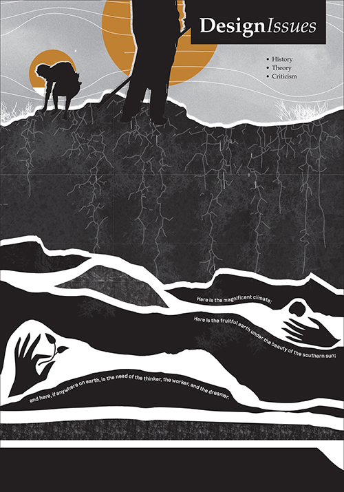
This article appears in Design Issues, Volume 38, Number 4, Autumn 2022
Collecting in the Time of Coronavirus
The COVID-19 pandemic and its ill effects began in China in January 2020 and spread throughout the world by March 2020. As this occurred, there was a sudden rise in data visualizations, in print and online, trying to communicate a new phenomenon. We had some awareness that a new infectious disease could be dangerous, but no one was prepared for a potentially fatal infectious disease spreading around the world in a matter of weeks. The global impact of COVID-19 surprised everyone, and we became fascinated by how this collective surprise was producing visualizations.
The internet made COVID-19 visualizations from around the world instantly available. That ubiquity combined with several pre-pandemic factors—easy access to data visualization software packages, the rising popularity of data journalism, the ability to share images on social media—motivated and enabled our collect- ing activity. Suddenly maps and charts were everywhere, like postage stamps being published in many countries, all serving a common function. Each visualization communicated some local or global aspect of the pandemic on a particular day to a specific audience. The maps, charts, and graphs were ephemeral by nature, templates that were refilled each day to communicate current data or yesterday’s news. Each visualization served its function, caught a reader’s attention, integrated with a text, invited a reader to click and scroll, and then was gone (see Figure 1).1
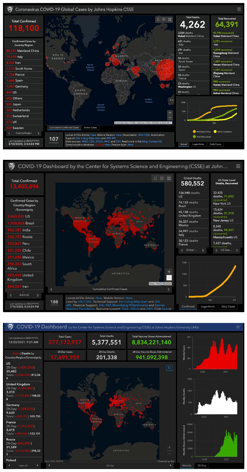
Figure 1
Three versions of the Johns Hopkins Coronavirus Resource Center Global Map: March 10, 2020; July 15, 2020; December 23, 2021. The Johns Hopkins dashboard was one of the earliest Covid-19 visualizations reporting data from the current day. © John Hopkins University, https://coronavirus.jhu.edu/map.html.
Why collect COVID-19 visualizations at all? Once collected, each image is no longer critical information or a call to action. It becomes history, like a recruitment poster for a war your grand- father may have fought in. Why copy and classify these things? Would anyone—data journalists, design students, art directors, social scientists, virologists, or epidemiologists—find value in flipping through thousands of visualizations about a global event in the past?
Qualitative and Quantitative Ephemera
Before trying to address these questions, we share observations based on many months of collecting. As the infection rate increased, deaths mounted, governments responded with public health restrictions, and our collective sense of normality was disrupted. Many parts of daily life, such as work habits, mobility, and social contact, changed dramatically. We became collectively unsure what was going on each day and what would happen next. The radical change in “normal” behavior and continuous uncertainty about how and when “normal” would return drove two communication needs. The first was the need to qualitatively communicate a series of messages based on medical concepts. What is this new disease? How does it spread? What should we do to stay healthy and stop the spread? Visualizations appeared to communicate scientific understanding of the disease’s etiology, life cycle, and the appropriate public health response (see Figure 2).
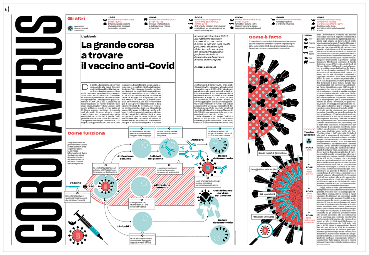
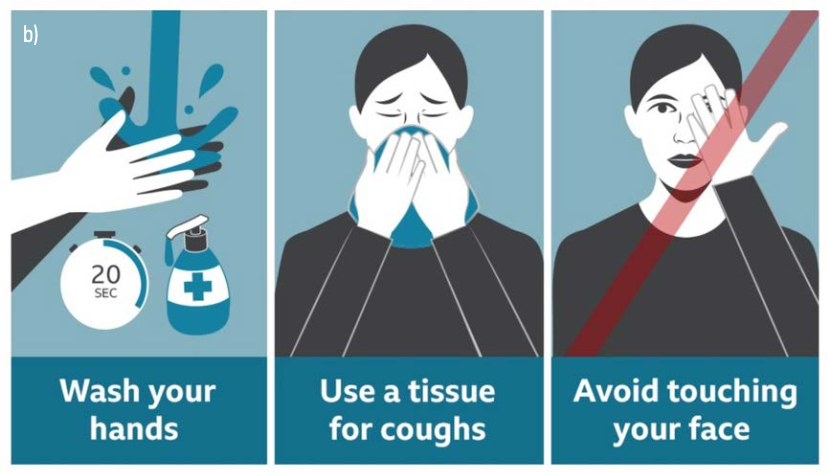
Figure 2
Qualitative Figures:
a) La grande corsa a trovare il vaccine anti-covid, Matteo Riva (#LIVE @larepubblica).
b) How to avoid Covid-19 infection (BBC News at bbc.co.uk/news).
In addition to explaining the detailed mechanisms of virology (spike proteins, receptors, messenger RNA), visualizations addressed the many theories of transmission and suppression; the interaction between face masks and airborne virus particles; and how air circulates in classrooms, buses, subways, and airplanes. As vaccine development got underway, many visualizations were created to explain their molecular biology, how they would be distributed, and how mutations in the virus could affect our immune response (see Figure 3).
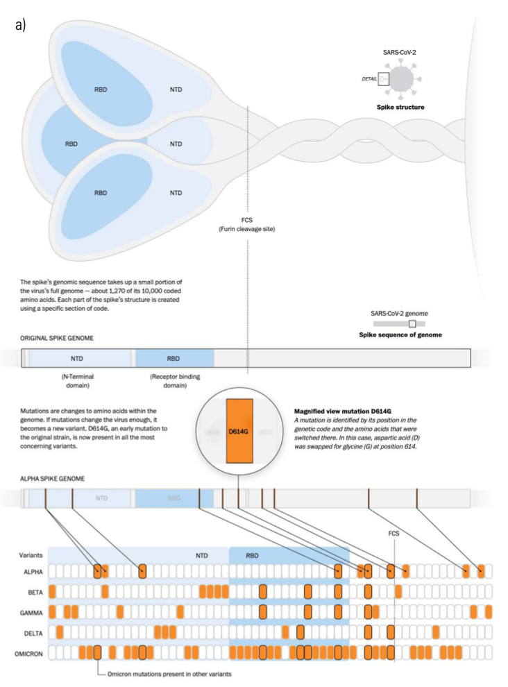
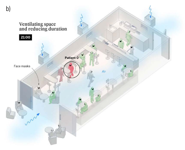
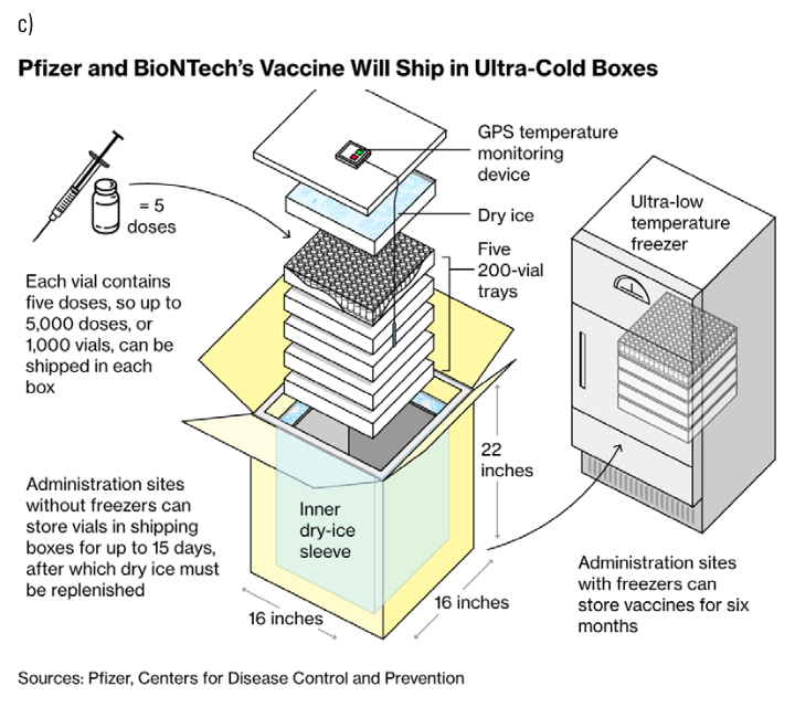
Figure 3
Qualitative Figures:
a) A look at the spike. This figure was first published in “Understanding omicron’s many mutations,” by Bonnie Berkowitz and Aaron Steckelberg, in The Washington Post on December 16, 2021.
b) Aerosol transmission of Covid-19: A room, a bar, and a classroom: how the coronavirus is spread through the air,
El País, November 28, 2020.
c) How the U.K. Plans to Lead the World in Covid Vaccination, Bloomberg, December 8, 2020. Design: Dave Merrill. Used with permission of Bloomberg L.P. Copyright
© 2022. All rights reserved.
The second was the need to collect, quantify, and publish in a visual format the data related to the spread and effect of the disease. Are things better or worse today than they were yesterday? Can the healthcare system handle what is happening? How do I measure the risks of action or inaction? We expect pub- lic policy changes and projected outcome to be based on data. Where were those numbers coming from? Were they consistent and understandable?
Epidemiologists need data to evaluate the spread of a disease and predict what will happen next. Political leaders need data to motivate actions and predict how the population will respond. Economists need data to measure financial health and predict the financial future. Parents need data to decide where and when to send their children to school. Journalists need data to tell a story. The COVID-19 pandemic challenged this diverse group to find, compile, and respond to a common set of daily numbers. Designers used expected chart types such as histograms, bar charts, and choropleth maps; they also created inventive combinations such as choropleth cartograms and doubled histograms of cases and deaths (see Figure 4).
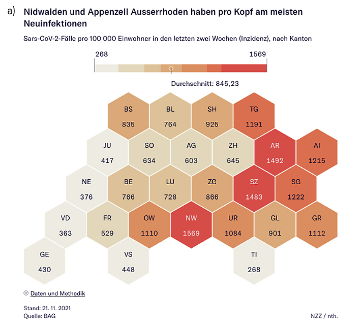
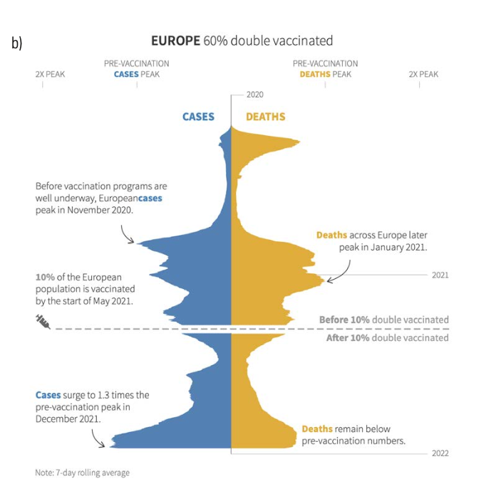
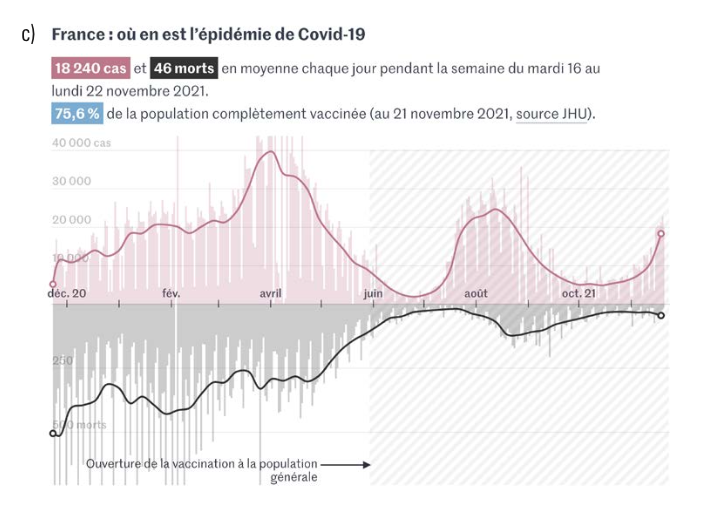
Figure 4
Quantitative Figures:
a) New cases per 100,000 by Canton in Switzerland, Neue Zürcher Zeitung [The New Zurich Times], November 21, 2021.
b) European cases and deaths from “Covid swells return to Europe,” Reuters Graphics, December 23, 2021.
c) Cases and deaths in France from “Covid-19: Autriche, Allemagne, Belgique, Pays-Bas… visualisez l’ampleur de la vague dans certains pays d’Europe,” “Les Décodeurs du Monde,” Le Monde [Austria, Germany, Belgium, the Netherlands… visualize the extent of the wave in certain European countries, “Les Décoders du Mode”], Le Monde. Avec l’autorisation du Monde [With the authorization of Le Monde].
Collecting a Problem Space
The material and conditions for collecting visualizations were present from the early months of 2020. It was, and still is, impossible to collect all visualizations, and it is premature to devise criteria to identify which visualizations will prove to be the most significant. We view our effort as outlining a space of possibilities, or a problem space, in the sense defined by Herbert Simon. We propose that there is more to be learned from this approach than from a prescriptive method that would select the “best” examples to preserve. Simon’s “problem space” is the mental area in which we understand a problem to be solved:
Every problem-solving effort must begin with creating a representation for the problem, a problem space in which the search for the solution can take place. Of course, for most of the problems we encounter in our daily personal or professional lives, we simply retrieve from memory a representation that we have already stored and used on previous occasions. Sometimes, we have to adapt the representation a bit to the new situation, but that is usually a rather simple matter.
Occasionally, however, we encounter a situation that doesn’t seem to fit any of the problem spaces we have encountered before, even with some stretching and shaping. Then we are faced with a task of discovery that may be as formidable as finding a new natural law.2
It is an open question as to whether the COVID-19 pandemic is an entirely new problem—an unprecedented disruption—or if it is a variation of a problem we have encountered before—another in a series of disruptions to our way of life. Perhaps it is a hybrid: a previously encountered problem we never learned how to solve. The uncertain answer to this question is one of the forces behind the production of thousands of images visualizing changes to our health, our social and economic lives, and our healthcare systems. Each visualization is a “representation” pointing in some way at the same phenomenon or referent. These images were created from the start of the pandemic and continue to the present day, referring to the same or very similar events.
We have collected COVID-19 visualizations to facilitate an unparalleled opportunity for study. The collecting of articles and the figures they contain defines this problem space by outlining it. Articles are selected based on two criteria:
- The presence of one or more visualizations related to the COVID-19 pandemic.
- The belief that the article is the source of the visualization.
Visualizations include manually drawn and software-generated visual representations in all their forms. We did our best to record the source of each visualization. We did not record how many times a visualization was posted for discussion, retweeted, or shared.
In those predetermined limits, COVIC has been assembled opportunistically, as examples were encountered, through a daily practice of reading, browsing, searching, and following linked references. Our goal to find visualizations from many countries and languages has benefited from the help of dozens of contributors. The bulk of the collection was recorded in the United States and France by Kahn, an English-speaking white American male. The sheer quantity of Anglo-American examples in the collection’s content has been shaped by this cultural affordance or bias.
The Figures are the Subject
It was Dubberly’s insight that COVIC should be a problem space consisting of visual representations and not the articles themselves. Interaction technique, visual technique, and visualization types are captured at the figure level, while subject, publisher, and publication date are assigned to an article. Each figure, therefore, is a child of its parent article and a peer of the other figures in that article (see Figure 5). We recognize that qualitative and quantitative visualizations are two communication techniques at the article level, alongside verbal rhetoric, photography, and typography. We provide an image of the full article as context for each visualization. However, COVIC does not try to address, evaluate, or collect communication techniques beyond those visualizations.
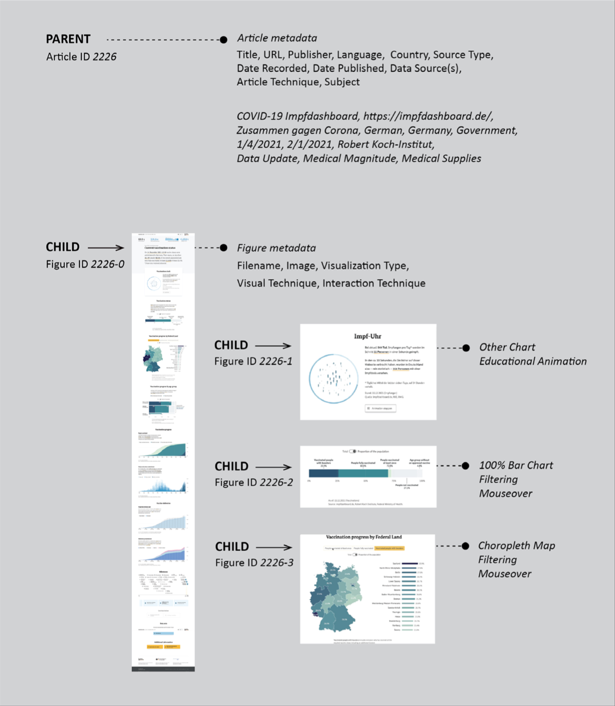
Figure 5
COVIC article–figure relationship. We assign metadata at the article level. Each figure is a child of an article parent, inheriting this metadata. We save an image of the entire article for reference. We save each figure and assign visualization type, visual technique, and interaction technique at the figure level. Source: Authors.
We propose COVIC as a resource for ongoing research in the disciplines that will respond to similar events. Graphic and information design, journalism, public health, epidemiology, economics, cognitive psychology, and computer science all come to mind. At the same time, we believe it is unnecessary and impossible to predict who will be seeking solutions by bringing their problems to this space.
The goal of creating a collection of artifacts of interest across a range of disciplines echoes and was informed by the concept of boundary objects articulated by Susan Star and James Griesemer:
Boundary objects are objects which are both plastic enough to adapt to local needs and constraints of the several parties employing them, yet robust enough to maintain a common identity across sites. They are weakly structured in common use and become strongly structured in individual-site use.
They may be abstract or concrete. They have different meanings in different social worlds, but their structure is common enough to more than one world to make them recognizable, a means of translation. The creation and management of boundary objects is key in developing and maintaining coherence across intersecting social worlds.3
COVIC is a boundary object by the very nature of the events that generated it. We hope it will support research into a diverse range of questions, such as:
How did a chart with three lines shut down the world economy?
- How was the same story interpreted by different designers and journalists?
- How did data and visualizations flow from research laboratories to journals to leading news outlets to secondary outlets to social media?
- How did print and online presentations of the same stories and graphics differ, even from the same publisher? (COVID-19 may be one of the last events of global magnitude covered more or less equally in print and online.)
- How were the large death milestones represented in different countries?
- What visual techniques were used to explain aerosol transmission?
The concept of a problem space has not been widely developed in design practice. There are a few famous posters—iconic chairs, cars, tools—that permit a designer to visually examine a range of possible solutions. There are typeface books and collections of portfolio examples. We think this kind of timely, opportunistic, digital collection exemplifies a new approach—collecting and preserving enough design samples during an event to describe a space. Moreover, this space is a response to a specific event bounded in time, which is nonetheless universal for all people. Thus, we believe COVIC can be important for discussing and evaluating design solutions.
In addition, we point to COVIC as an example of a new approach to knowledge building and design research: considering bodies of work rather than only individual examples. We propose that a great deal could be learned by examining a visualization space. Designers might also learn by presenting the collection (or subset) in a variety of ways, whether as an article, slide sequence, or exhibition in analog or digital format. We imagine the ability to walk around the collection, to view this space from different heights and angles, to pan and zoom, and to sort and filter each figure from different publications, countries, and languages, all derived from the same event.
Assembling Examples to Outline the Problem Space
To create the collection, we followed an iterative method. Kahn began collecting visualizations as a way to engage with the global uncertainty that was surging from his computer screen. He sent a request asking colleagues and former students to send him examples. The request was framed broadly, asking for any web page that contained any kind of a data visualization—provided the intention was to explain any aspect of the COVID-19 pandemic:
- Bar charts, line charts, maps, bubble and scatter plots, timelines, graphic simulations, static infographics
- Any example of visualizing the current pandemic data, past, current, or projected
- Any visualization concerning how the pandemic was affecting any part of the population or business sector
- Any visual explanation related to the disease; social behavior related to disease prevention, and so on
- Any examples that visualized local information—inside a county, region, department, or city.
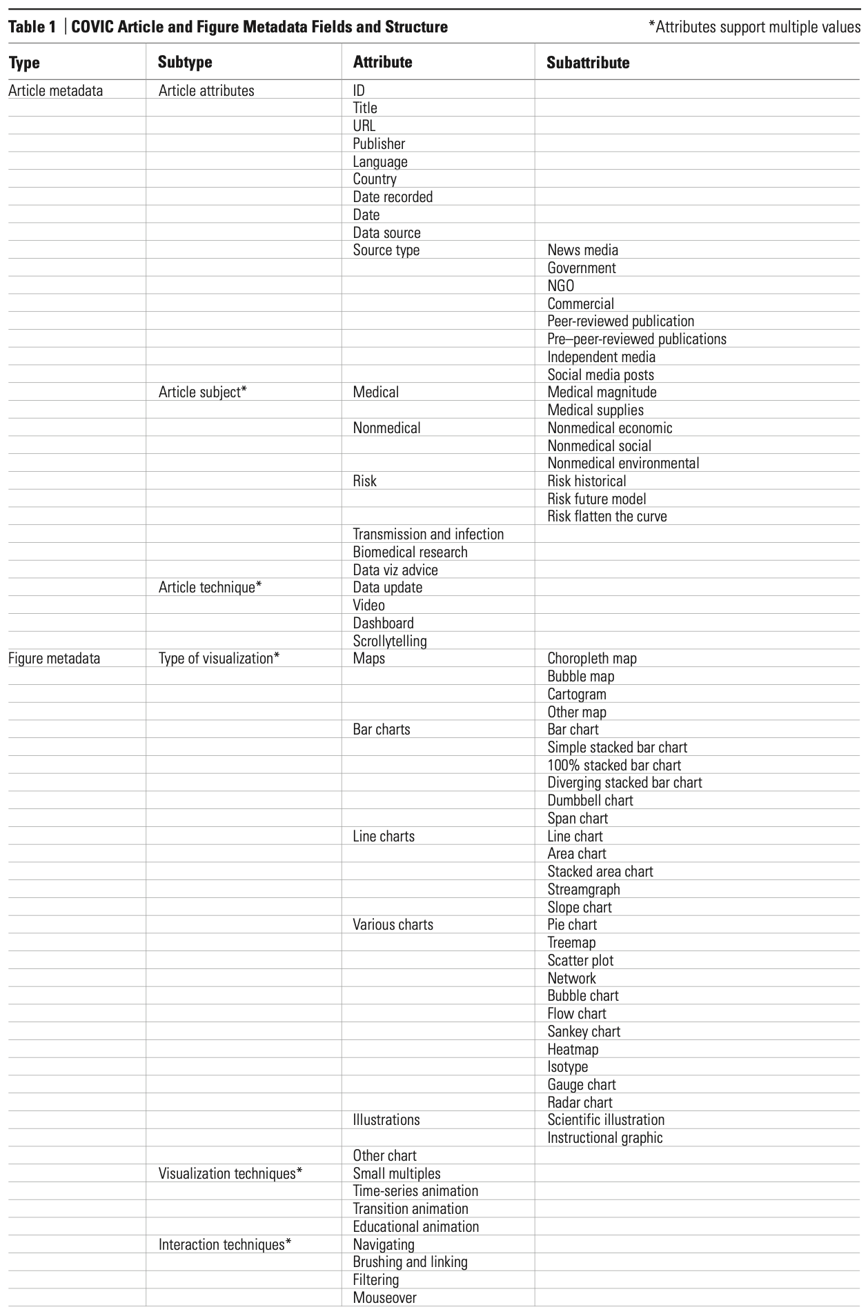
Yixuan Zhang, a graduate student with training in public health and computer science, responded to this request. Zhang had independently begun collecting examples of pandemic-related data visualization as part of her doctoral research. She devised metadata for Kahn’s examples, using an ad hoc classification scheme that captured an article’s publisher, language, source type, date, visualization types, interaction characteristics, and subject. Zhang also collected examples for her own research, focusing on data visualization types. They merged their examples and examined the two lists as a single collection, then went through several iterations to develop a more formal scheme of data visualization types, as well as visual and interaction techniques. The subject categories were developed heuristically by examining patterns in this early collection (see Table 1). Zhang returned to her PhD research, modified the metadata schema according to her needs, and independently developed her own set of examples.4
In this way, COVIC evolved from a table in a spreadsheet application—rows of articles with columns of attributes—into an online database. Our task was to collect and visualize a large set of images. By examining the software techniques which we followed to develop the collection, an interesting observation was made: As multiple contributors became involved, local spreadsheet files migrated to shared documents, using the familiar and freely available Google Sheets. Following trial and error, we settled on unique article ID numbers for filenames as the method for saving and storing images to be associated with each article row. These image collections were stored on a shared Google Drive. To see the collection—to visualize the visualizations—Matthew Siu, a member of the Dubberly Design Office, with a background in cognitive science and programming, created COVIC Visualizer 1.0 using the Heroku platform. The application integrated CSV files exported from Google Sheets with images stored on a cloud server.
Within a few months, the collection grew beyond the scale of these initial software tools and platforms. As the number of figures approached 10,000, the Google Sheets and initial COVIC Visualizer degraded—the software’s way of telling us to move on to version 2.0. We migrated the collection to Airtable, a spreadsheet- database hybrid platform. This environment proved capable of managing the large number of records and image data with excellent response time. It also provided a reliable API for a programming team (Cody Wackerman, Sean Durham, Robbie Roxas, and Wilbert Mui) to build a COVIC Visualizer 2.0. See Figure 6 for a representation of the current software architecture combining the website, the viewer, and the database.
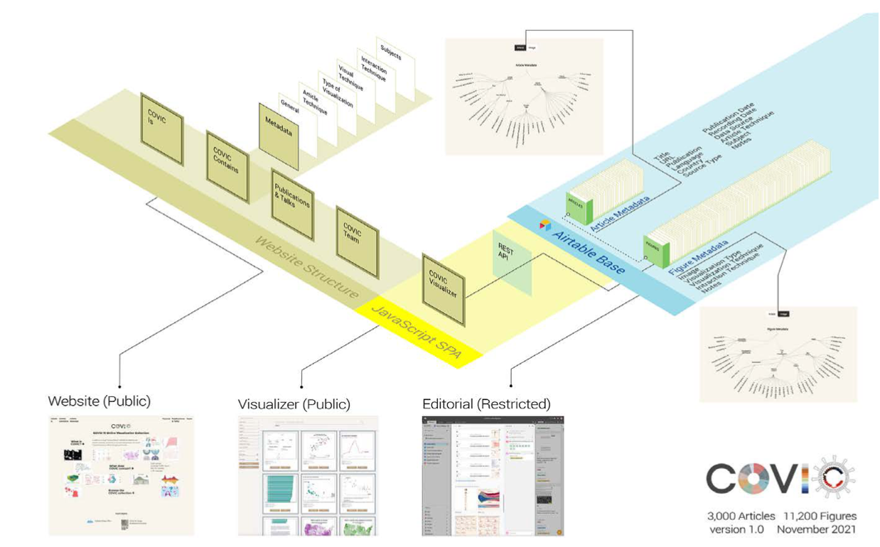
Figure 6
An overview of the COVIC system architecture: a website linked to a Javascript SPA and an Airtable base containing images and metadata. Source: Authors.
The viewer (See Figure 7 and Figure 9, p 60) is a Javascript SPA (Single Page Application) designed to search, sort, filter, and examine sets of images and their associated metadata stored in the Airtable backend. Sets of figures can be filtered by one or more combinations of attributes, for example:
- choropleth maps published in Germany between January 15, 2020, and June 15, 2021
- scientific illustrations from articles containing the word “mask” in the title
- area charts or stacked area charts from “nonmedical economic” articles
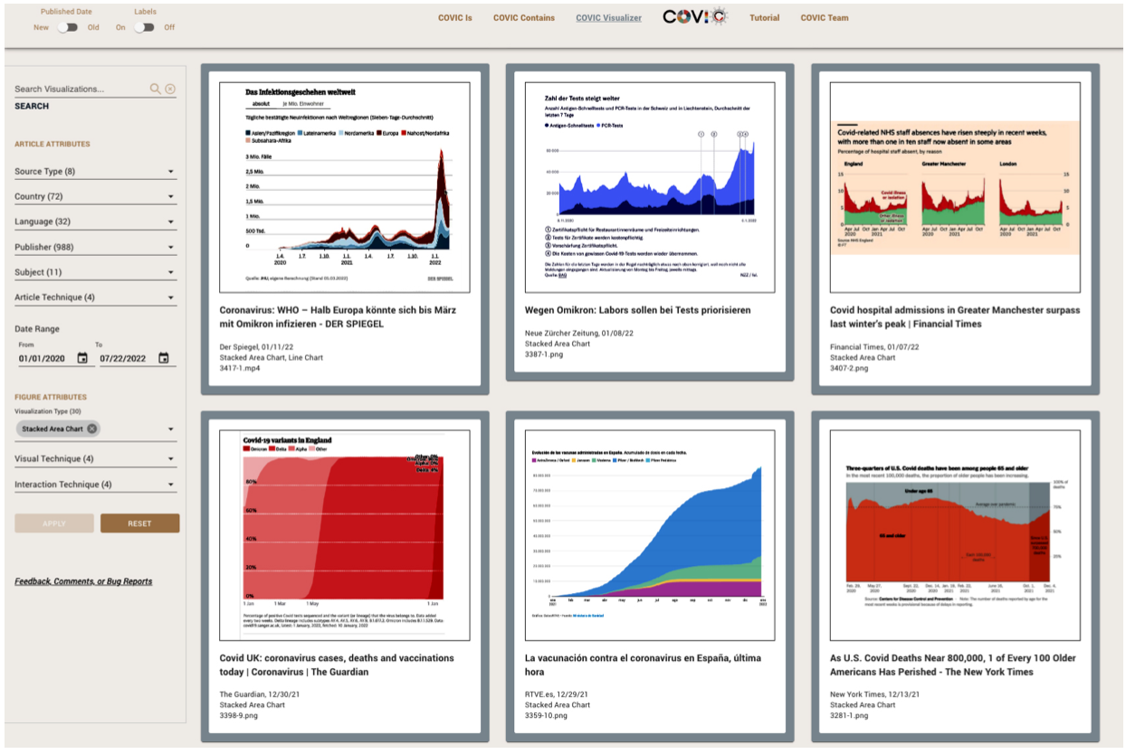
Figure 7
The COVIC Visualizer filtering figures with visualization type: stacked area chart. Source: Authors.
In addition to being able to sort, filter, and examine the individual figures, we wanted researchers to have an overview of the collection. Rodighiero generated an overview by processing the figure collection with an Inception Convolutional Neural Network, trained on ImageNet 2012, and projected into a two-dimensional manifold with the UMAP algorithm. This software produced an interactive visual landscape based entirely on image analysis so that similar images appeared proximate to one another. The result was a layout of points to be viewed in Trails—a system developed at Yale Digital Humanities Lab for exploring large collections of art images from museum collections (see Figure 8). Using this overview, the researcher can move in and out of the space, viewing clusters from a distance or moving forward to examine individual images, learning from another kind of order and arrangement. Currently, the COVIC Visualizer and COVIC Trails are independently linked to the figures. They allow the user to follow a link from the figure to the source article. Integrating the two views, giving the researcher a means to navigate from the Forest to examine individual Trees, is a future development goal.
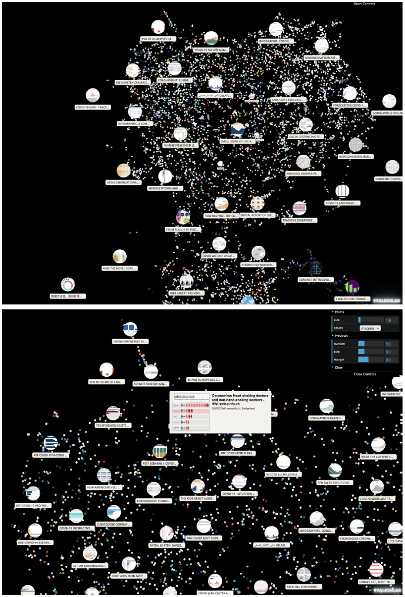
Figure 8
Two views of the COVIC images visualized in Trails: the shape of the entire cloud with generated figure vignettes (top), zoom view with controls open and figure selected (bottom). Source: Authors.
Although our experience demonstrates that off-the-shelf software can support such a project up to a point, integrating all the pieces and managing the APIs still requires considerable programming training and experience. Given how far we are into the information age, it’s surprising how much effort was required to create a system for managing and viewing the collection. The step function in learning to do-it-yourself remains frustratingly high. Our experience illustrates how the software industry has failed to provide tools that are both powerful and easy to use, the tools needed by nonprogrammers to build collections of text, images, and meta-data at the scale called for by major events.
To create COVIC Visualizer 2.0, we engaged professional programmers to achieve the quality needed to support our teaching and research audience. The source code for the COVIC Visualizer is available on an open-source license on GitHub. It should be quite easy to copy and paste the scaffold and then plug in data from another collection.
A Gift for the Future
During the collection period, we became aware of several predecessor collections, and each helped us refine our concept of what COVIC would become.
The American Influenza Epidemic of 1918: A Digital Encyclopedia,5 hosted at the University of Michigan, provided a useful example of a digital archive from a nondigital age. Much of that collection consists of photographs, scans of news articles, time- lines, and original articles documenting events during the 1918–1919 influenza epidemic in 50 US cities.
The Japan Disaster Digital Archive,6 developed at the Edwin O. Reischauer Institute of Japanese Studies, provided a model of an archive designed for educational use. This multimedia collection focuses on eyewitness accounts of several natural disasters, with the intention of making them available for classroom and research purposes. Its creation was motivated by the Fukushima nuclear disaster in 2011.
Through the thesis work of Kyle Thomas Parry,7 who participated in the Japan Disaster Digital Archive, we found additional information about digital archives on other natural and man-made disasters, including the Alaska Resources Library & Information Services (ARLIS) archive of documents related to the 1989 Exxon Valdez oil spill,8 and the Hurricane Digital Memory Bank about Hurricanes Katrina and Rita in 2005, organized by the Roy Rosenzweig Center for History and New Media (RRCHNM, formerly CHNM) at George Mason University and the University of New Orleans.9
Comparison of COVIC to these earlier disaster archives highlights several important differences. COVIC was created during rather than after this pandemic event. These earlier collections have digitized and organized large amounts of nondigital materials— eyewitness accounts, printed news stories, documentation, and photographs—to create a retrospective digital repository or memory. COVIC is being created by collecting and classifying digital artifacts during the event. This timing and design focus allows us to benefit from several advantages not shared by these retrospective/ comprehensive collections.
First, collecting during the pandemic enables us to respond to the ephemeral nature of the online materials, collecting and recording them as they appear. Not everything on the Internet lives forever. As new materials appear each day and links or references to sources lead to previous publications, we can respond to the events and data sets that generate visualizations before they disappear.
Second, this collecting-in-the-now requires a certain amount of suspended (not to be confused with lack of) judgment concerning what will be valuable in the future. By leaving conclusions to an imagined future audience, we hope we will help researchers answer questions we are not aware of.
Third, by focusing entirely on visualizations our archive does not propose to represent the entire complex global event. We are collecting and classifying design objects that exist at the intersection of many disciplines and activities. These design artifacts variously serve to communicate public health, scientific research, political policy, and news for specialized and general audiences. Our understanding of the design issues associated with these artifacts existed before, is being informed by, and will exist after the events that generated them.
We also became aware of the Collection of COVID-19 Visualization Worldwide,10 a project hosted at Peking University Visualization Lab (PKUVIS Lab). We applaud the effort of the PKUVIS team members, who are clearly responding to an impulse we share—to preserve artifacts of an event in digital form. Their work has reinforced our vision.
The COVID-19 pandemic arrived late in a period of enormous analog-to-digital transition that has affected many industries. Newspapers have been at the forefront of that transition, though not always by choice. During the twentieth century, newspapers and other publishers created image “morgues,” banks of filing cabinets in which clipped stories and copies of photos were stored according to an indexing scheme devised by a librarian. These collections were often the go-to source for an image or description of something suddenly in the news. They could be a valued resource for more complex investigative reporting.11
Kahn witnessed the transition from clipping files to electronic databases firsthand. He was a communications specialist in the 1980s tasked with setting up BASIS-70,12 an information retrieval system sold to newspapers. Once the digital files of the newspaper were loaded, the BASIS application made all past stories available to staff members through the editorial terminals at their desk. Suddenly, there was less time and space between the question and the answer. Without having to search through drawers and folders, any reporter could look up information about any local person. The language of stories published over many years could be analyzed and calculated. The software revealed that the most common words used in Kentucky’s Lexington Herald Leader were “coal” and “horses.” The most common word in New Jersey’s Bergen Record was “murder.”
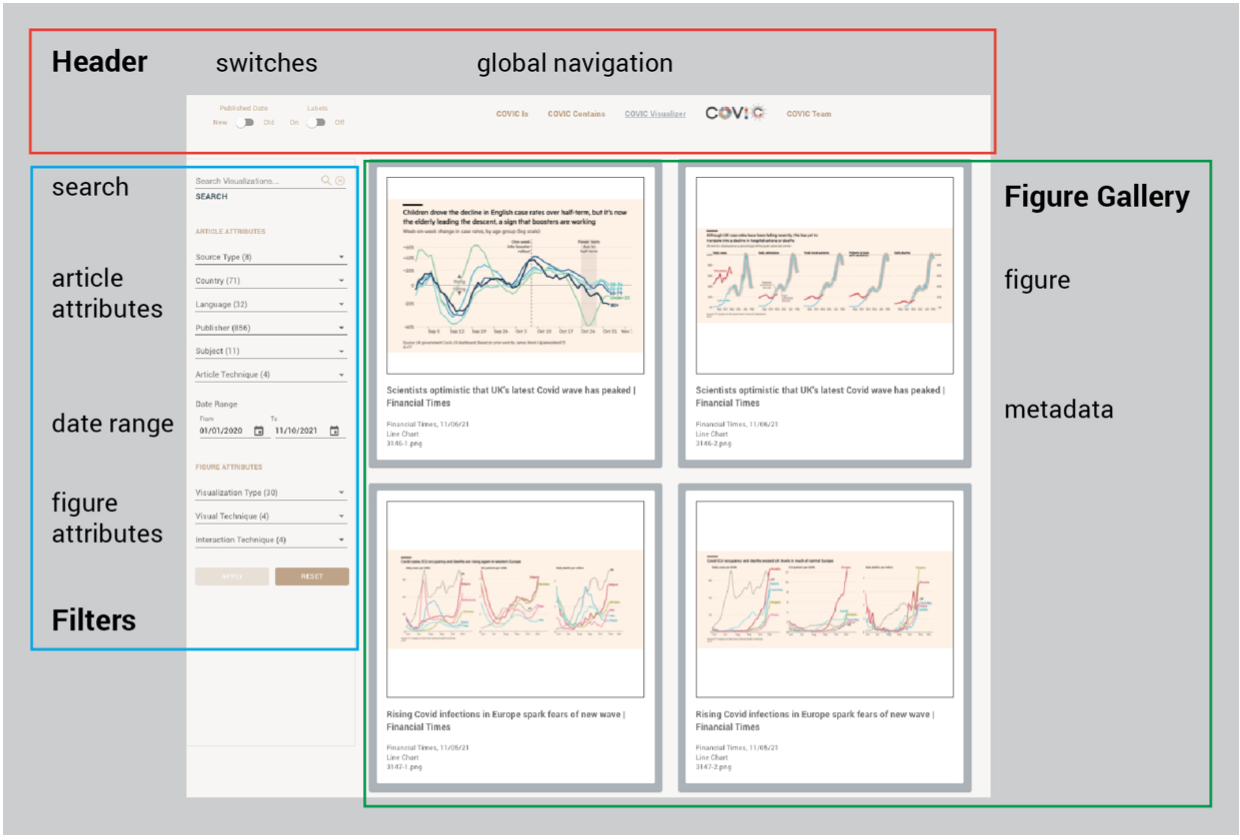
Figure 9
The COVIC Visualizer user interface features. Source: Authors.
Possible Pathways Through the Collection
The ongoing task of creating COVIC has become the process of assembling a gift for the future, supported by friends, colleagues and students. In the twenty-first century, we have come to expect access to previously unimaginable text and image collections from our various devices. Faced with the explosion of visualizations in early 2020, the initial impulse of many designers was to look for the best: the best interactive histogram, the map with the best color scheme, the best animated explanation of how a virus can spread, the best area chart to represent “flattening the curve.”
We were interested in creating a space where inquiries can be made that lead to new knowledge over time and across areas of expertise. We have sought to create a boundary object as a resource for the disciplines brought together in response to this event.
COVIC also represents an individual leading a small team, to assemble and share a collection of thousands of images from a worldwide event in near real-time, an idea that would have been hard to believe a decade ago. In the end, it is remarkable that such a gift can be assembled.
As we look toward closing the collection process when the pandemic ends, we propose ways we can apply what we have gathered to serve the purposes of design research. The publication dates of the figures will support a variety of chronological views. The constant use of some visualization types that lend themselves to expressing time-series data, such as line charts, can be contrasted with the ebb and flow of types well suited to location data, such as cartograms and bubble maps. Exploring the effect of similar figures with and without interaction—a static line chart comparing the case numbers in three countries versus an interactive line chart presenting case numbers for all countries that can be selected, filtered, and clicked on to display the numbers behind each point—will expose relative strengths and weaknesses of print and online visualizations. By selecting the figures for a single publisher or a country, students will quickly see the quality of art directions and a culture’s preferred color palettes. Students can analyze the perception, brand, and cultural features of visualization color. The scientific illustrations of the virus, vaccines, and the human immune system are a rich problem space for examining information design principles and technique. They contain a range of visual representation strategies generated under enormous pressure to explain the invisible to general and scientific audiences. Their strategies range from abstraction to symbolism to 3D models presented in single-frame, narrative flows, and video animation styles.
We hope the collection will become a field for continuing critique of comparisons, explorations, and analyses. We hope to foster new understandings of how visualizations can serve our information needs during times of global crisis. For additional information, see the COVIC Online Resource Locations below.
The COVIC Online Resource Locations
COVIC website
COVIC Visualizer
COVIC Trails
COVIC GitHub code repository
Acknowledgments
We are grateful to Paolo Ciuccarelli and the Northeastern University Center for Design for providing an academic home for the collection and associated applications.
Endnotes
- Ensheng Dong, Hongru Du, and Lauren Gardner, “An Interactive Web-Based Dashboard to Track COVID-19 in Real Time,” Lancet Infectious Diseases 20, no. 5, https://doi.org/10.1016/S1473- 3099(20)30120-1 (accessed May 1, 2020).
- Herbert Simon, “Finding New Problem Representations,” in The Sciences of the Artificial, 3rd ed. (Cambridge, MA: MIT Press, 1969).
- Susan Leigh Star and James R. Griesemer, “Institutional Ecology, ‘Translations’ and Boundary Objects: Amateurs and Professionals in Berkeley’s Museum of Vertebrate Zoology, 1907– 39,” Social Studies of Science 19, no. 3 (1989); https://doi.org/10.1177/030631289019003001.
- Yixuan Zhang, et al., “Mapping the Landscape of COVID-19 Crisis Visualizations,” in Proceedings of the 2021 CHI Conference on Human Factors in Computing Systems, May 2021, art. no. 608, 1–23, https://doi.org/10.1145/ 3411764.3445381.
- See “The American Influenza Epidemic of 1918: A Digital Encyclopedia,” University of Michigan Center for the History of Medicine and Michigan Publishing, n.d., https://influenzaarchive.org/.
- See “Collections Results,” Japan Disasters Archive, n.d., https://jdarchive.org/en.
- Kyle Thomas Parry, “Crisis Archives: Assemblage, Interaction, Participation,” PhD diss., Harvard University, https://dash.harvard.edu/bitstream/handle/1/23845456/PARRY-DISSERTATION-2015.pdf.
- ARLIS, Exxon Valdez Oil Spill,” n.d.
- Hurricane Digital Memory Bank, http://hurricanearchive.org/.
- Collection of COVID-19 Visualization Worldwide was located at http://vis.pku.edu.cn/covid19vis_collection/#/.
- “Inside the New York Times’ Photo Morgue, A Possible New Life for Print,” WNYC, 2012, https://wnyc.org/story/206643-wnyc-tumblr/.
- For the history of BASIS-70, see Charles P. Bourne and Trudi Bellardo Hahn, A History of Online Information Services, 1963–1976 (Cambridge MA: MIT Press, 2003).